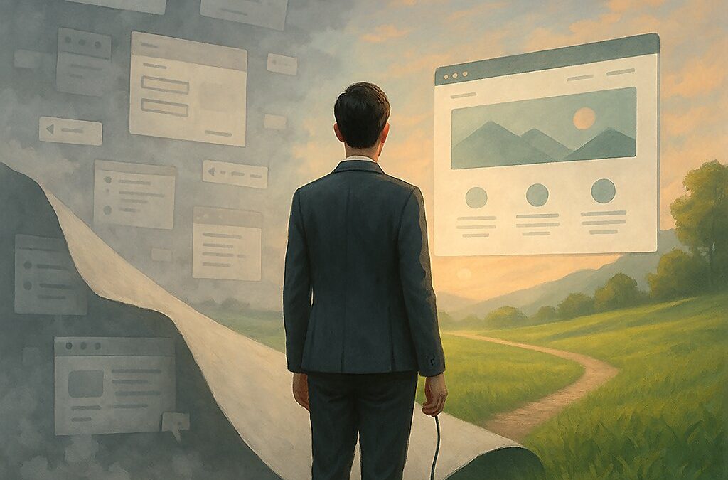
Outdated Website Design Is Like Wearing Skinny Jeans in 2025 — Let’s Talk About That
You ever get that weird nostalgic pull to an old hoodie that’s two sizes too big, faded, smells like forgotten popcorn, and somehow… still makes you feel safe?
Yeah. That’s how a lot of people treat outdated website design.
It’s comfortable. Familiar. You know where all the buttons are. The habits are hardwired—muscle memory kicks in. You might even say, “Well, it’s not that bad.” (It is.) But look, I get it. I’ve done it too. Held onto an old layout because redoing it felt like emotional surgery. Change? Ugh. No thanks.
But we can’t ignore this anymore. Not if we actually care about results. Not if we’re serious about standing out in a world where everyone scrolls at 5G speed and bounces faster than your old MySpace page loads.
Let’s call out some of these dusty old habits—these digital cobwebs—and, you know, shake them off.
Sliders: The Digital Revolving Door of Meh
Sliders on homepages. Please—let. them. go.
You load a site, the first slide appears. “Welcome to our company!” (cool). Two seconds later—whoosh—“Check out our latest offers!” (wait, what was that?). Then—BAM—“Meet the Team.” Then—wait, where’d it go?
Why do we do this to people?
I once built a site with seven slides. Seven! Like a PowerPoint deck got drunk and collapsed on a homepage. I thought I was being fancy. Turns out, nobody watched beyond the first slide. It was like screaming into the void, hoping someone would listen after they already left the room.
The data agrees. Conversion rate drops, engagement tanks. People ignore sliders. They tune them out like elevator music.
Instead: Just… say what you do. One hero image. A clear message. No carnival ride. Imagine walking into a bakery and someone yells, “We bake bread! Try the sourdough!” Not, “We make bread! Wait, no, cakes! Oh and we have coffee, AND—” door slam.
The Fold Is Dead. Long Live the Fold. Wait, Maybe Not?
Once upon a digital time, someone said, “People don’t scroll. Put everything above the fold!” And suddenly, every website looked like an infographic had a panic attack.
I remember this one site I worked on—crammed the navigation, headlines, a form, and a CTA all above the fold. It looked like a menu for a 24-hour diner. My client said, “It looks full of value!” I said, “It looks like it’s screaming at me.”
Reality check: people do scroll. Look at TikTok, Instagram, Twitter (okay—X—still not used to that). Scrolling is life. Thumbs are conditioned to swipe like second nature now.
But—here’s the twist—what’s above the fold still matters. That’s your hook. But you don’t need to jam the whole orchestra in there. Just set the tone. Let curiosity lead the way.
Text Walls: The Internet Equivalent of a Monologue from a 1940s Detective Film
Here’s the thing. People say “content is king.” But they forget—presentation is queen. And she’s the one people actually pay attention to.
Big blocks of text feel like reading a textbook during a power outage. You know there’s something valuable in there… but is it worth the effort? Probably not.
I once saw a homepage with 1,500 words. Front and center. No images. No subheadings. No mercy. It felt like reading an old pirate’s journal—but without the treasure.
Break it up. Use space. Let the page breathe. Add pauses. Dashes. Parentheses. Let people skim, because trust me—they will.
Side note: did you know the average person decides whether to stay on your site in less than 8 seconds? That’s shorter than most TikToks. Think about that the next time you’re tempted to write a paragraph that rivals the Gettysburg Address.
“Contact Us” as Your Main CTA? That’s It? That’s the Tweet?
This one’s personal. Because I used to do this all the time.
I’d spend hours designing pages. Beautiful, responsive, punchy copy. Then I’d end it with “If you have any questions, feel free to contact us.” That’s like proposing marriage with a text that says, “Hey. U up?”
People don’t want vague. They want direction. They want confidence. And clarity.
Instead of hoping they dig through your nav menu to find a dusty “Contact” button, tell them what you want them to do. Schedule a call. Grab a free download. Book a demo. Get the PDF. Take the first step.
Yes, this feels pushy. And yes, pushy works—if you’re offering something of value.
Pretty Templates With No Soul (aka IKEA Without Instructions)
You know those websites that look amazing but… nothing works? It’s all images and animations but no clear structure. Like an avant-garde art piece made with zero user testing.
Templates are great. Until they’re not. I’ve seen businesses fall in love with a design—“It’s so sleek!”—but it had no strategy, no SEO structure, no CTA, and loaded like a tortoise on a treadmill.
A good website isn’t just about looking good. It’s about working good—functioning—with clarity, logic, and purpose.
Think of your website like a restaurant. Nice decor gets them in. But if your menu’s confusing, service is slow, and no one takes their order… they leave hungry.
You need a plan. Not just a page. Who’s your audience? What do they need? How do you solve it? That’s the difference between a brochure and a business asset.
Last Words: Burn the Old Playbook (With Love)
Look—I’m not here to shame anyone. We’ve all been there. Clinging to old ways. Defending choices that felt right… in 2012. Maybe even 2019.
But now, things move fast. Attention spans are short. People judge with their thumbs and decide with their gut. Your website needs to feel right before it even makes sense.
So here’s the part where I get slightly preachy: Let go. Upgrade. Adapt.
That slider you love? Retire it.
That wall of text? Slice it.
That passive “Contact Us” button? Replace it with a CTA that dares people to act.
Stop thinking of your website as a one-time project. It’s a living thing. A mirror. A silent ambassador for your brand. And if it’s not pulling its weight, it’s time for a talk.
You don’t need to start from scratch. But you do need to start moving forward.
Or hey—keep your digital skinny jeans. Just don’t expect them to convert.