“I spent weeks designing every detail… and people just leave. No comments. No conversions. Just silence. What did I do wrong?”
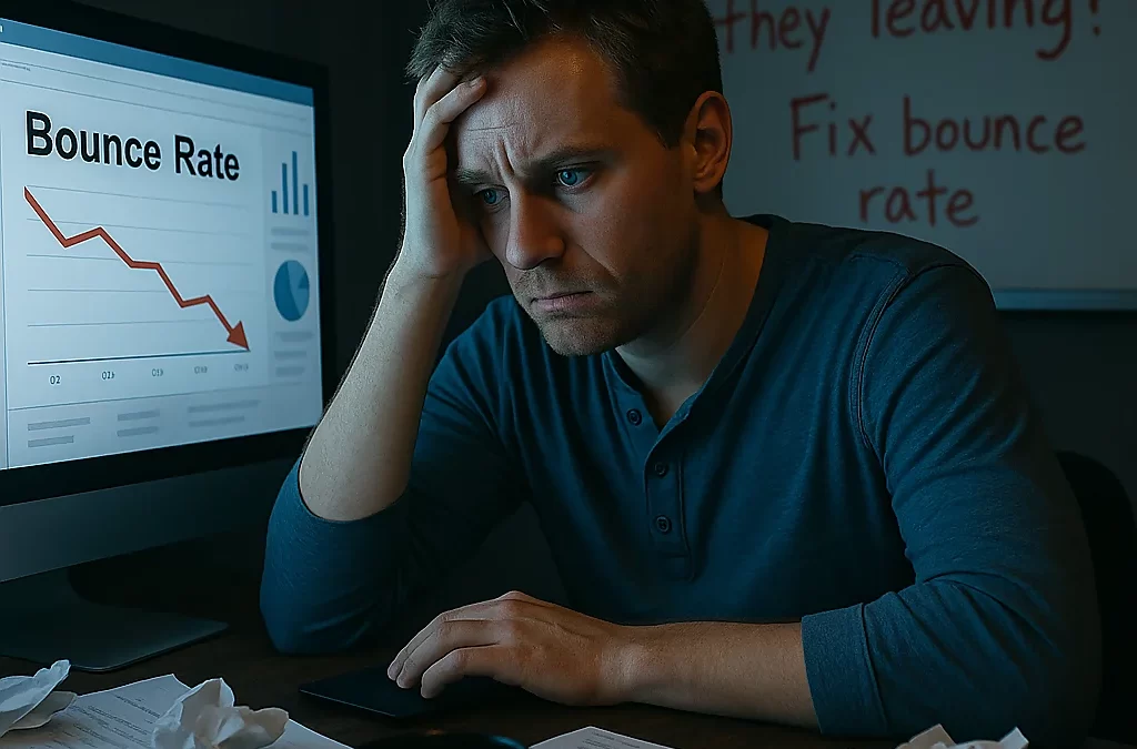
It’s one of the most gut-wrenching experiences in website design: launching a site you poured your soul into, only to check the analytics and see high bounce rates. Visitors arrive… and vanish. It feels like rejection. You ask yourself over and over: Why are they leaving? What am I not seeing?
You’re not alone in this. This isn’t just a technical issue—it’s a psychological blow. It makes you question your design, your content, even your abilities. But the truth is, bounce rate is a signal, not a sentence. If users are bouncing, your site is telling you something. You just need to learn how to listen.
Let’s dive deep into why this happens—and how to fix it with both empathy and strategy.
The Emotional Weight of a Silent Exit
When someone leaves your site without engaging, it can feel personal. You wonder if your idea isn’t good enough. If your message fell flat. If your work is, somehow, invisible.
This internal voice creeps in:
“Why do I even bother?”
“Maybe I’m just not cut out for this.”
“I followed all the advice. Why isn’t it working?”
But here’s the truth: people don’t bounce because you’re a failure. They bounce because something—content, design, load time, messaging—didn’t immediately connect. And the good news? Every one of those things can be fixed.
Let’s unpack the real reasons users bounce—and how to turn that silent rejection into engagement.
1. Your Site Takes Too Long to Load
The Emotion:
“I just got here. Why is nothing happening?”
Today’s users have zero patience. If your site takes more than 3 seconds to load, over 50% of users will leave. They won’t even give you a chance.
The Fix:
- Compress images
- Use lazy loading
- Optimize hosting
- Minimize scripts and plugins
- Use a CDN
Use tools like GTmetrix or PageSpeed Insights to find the exact bottlenecks and fix them.
2. Confusing or Overwhelming Design
The Emotion:
“Ugh… I don’t even know where to look.”
Too many fonts. Flashy animations. A cluttered layout. When users land on a site that feels chaotic or unclear, their brain says “Nope.” They close the tab without even trying.
The Fix:
- Stick to 1–2 fonts
- Use whitespace generously
- Create clear visual hierarchy
- Use one dominant CTA per page
Remember: clarity beats creativity.
3. You’re Speaking to Everyone—Which Means You’re Reaching No One
The Emotion:
“This isn’t for me.”
If your headline or homepage doesn’t immediately speak to your ideal user’s problem, they’ll assume they’re in the wrong place. Generic messaging is the silent killer of engagement.
The Fix:
Use specific, emotionally resonant language. Your hero section should scream:
👉 “I see you. I get your problem. I have the answer.”
Instead of:
“We build websites.”
Try:
“Struggling with a site that doesn’t convert? We fix that.”
4. Poor Mobile Experience
The Emotion:
“This is so hard to navigate… forget it.”
Over 60% of users visit sites from mobile devices. If your layout is broken, buttons are too small, or text is hard to read, they’ll bounce without thinking twice.
The Fix:
- Use a mobile-first design approach
- Test your site on multiple screen sizes
- Make CTAs thumb-friendly
- Avoid popups that are hard to close on mobile
5. They Don’t Know What to Do Next
The Emotion:
“Okay, now what?”
If users land on your site and can’t instantly see what they’re supposed to do, they’ll leave. The brain craves direction. Don’t make people think—tell them where to go.
The Fix:
- Add clear CTAs above the fold
- Use buttons that stand out
- Make navigation intuitive
- Tell users exactly what happens next
Instead of “Learn More,” try:
“See How We Can Help You Increase Sales”
6. The Content Doesn’t Match the Click
The Emotion:
“This isn’t what I expected.”
If someone clicks a link expecting a tutorial and gets a product pitch, they bounce. If your ad promises a solution but your landing page is vague, you lose trust instantly.
The Fix:
- Match your page content to the intent behind the traffic source
- Use headlines that confirm they’re in the right place
- Deliver value fast—don’t bury it beneath fluff
7. They Feel No Connection
The Emotion:
“This feels cold. Just another sales page.”
People bounce when they feel like just another visitor, not a human being. If your site lacks personality, story, or empathy, it feels transactional.
The Fix:
- Add real photos of you or your team
- Share your “why” in your copy
- Use language that’s warm, human, and relatable
- Embed testimonials or case studies for credibility
What Bounce Rate Is Trying to Tell You
It’s not saying “You suck.”
It’s saying:
🟡 “You’re not connecting.”
🟡 “You’re not speaking clearly.”
🟡 “You’re not ready… yet.”
And that’s okay. Because now, you can fix it.
Bounce rate is just feedback—a blinking signal telling you where to dig deeper.
Take Back Control: What You Can Do Today
✅ Run a heatmap analysis with tools like Hotjar or Microsoft Clarity
✅ Test your messaging—does your headline clearly address a problem and solution?
✅ Speed up your site—every second matters
✅ Simplify your design—remove one thing that clutters the experience
✅ Ask for feedback—real users will tell you what’s confusing
You’re Not Broken. Your Site Just Needs Tweaks.
If you’re feeling discouraged by bounce rates, remember this: it’s not a sign of failure. It’s a sign you’re in the middle of the process. Every great site you admire went through dozens of revisions to get there.
You’re not behind. You’re just refining.
So don’t panic. Don’t give up. You’re learning how to connect. And that’s the most powerful thing you can do.